
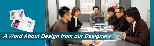
Featuring a simple but bold design and highly unique colour scheme, bizhub reflects the vision of its designers, who created this unique machine to meet customers’ needs and enhance overall office comfort.
Yoshitaka Isogai – bizhub Product Designer
“We aimed to reposition bizhub as a networking gateway, not simply another conventional copier. After repeated discussions, we decided to centrally group the sections that display information, and we emphasised them with white lines to symbolise a network, and to provide excellent contrast against the black body. We also used black to improve the visibility of paper-handling areas, to assist users when setting documents in place, and to enable at-a-glance recognition of the output paper. This sectional use of black greatly enhanced the overall colour balance. Of course, we also made sure that the unit would appear stylish and attractive, but not distracting, in an office environment.
One of the main features of the new bizhub is its control panel. It tilts up and down as well from side-to-side. The control panel features blue LEDs, which are easily recognised by users with impaired colour vision. To determine the most appropriate position for the side-to-side rotation of the control panel, we conducted simulations based on a statistical approach. This was done to ensure easy use by both tall and short people, as well as people in wheelchairs. We also conducted a number of simulations to determine the optimum size and shape of various parts; such as the heights and depths of paper trays, the shape of the handle on the automatic document feeder, the position of the paper cassette handle and the texture of the paper feed tray surface, among others.
We adjusted the contrast of the arrows and characters indicated on the inside and outside of the machine, as well as the illustrations and other indications on the control panel display. And, we chose a contemporary font to clean and refine the appearance.”
Yusuke Ikeda – bizhub GUI Designer
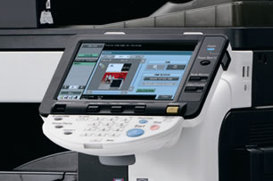 “Our design considerations also extended to legibility improvements on the high-resolution colour LCD. We created a new alphanumeric font to ensure that the characters were large, sharp and easy to read. Then we maximised the characteristics of the colour LCD through software design. For example, we selected indication colours that are easy to see by users with impaired colour vision, and added a “Search by Purpose” help menu to make searches easier. The screen for the fax/scan functions features a zoom function, and the printer driver supports text recognition software.”